Akihiro Furuta
12 Dec 2008

Happy birthday of dog
9 Dec 2008
Recently I’ve had a couple of clients ask me for advice on email marketing or how best to send newsletters out to all their subscribers, and there’s also been some discussion about this on the Php London mailing list.
Looking around, and talking to other people, we have the following shortlist of recommended packages:
Some clients are unhappy with the idea of paying a subscription to send emails, and would rather pay a larger one-off fee for unlimited use, or get their own software. Not a problem if we’re sending email to a relatively small number of subscribers (think hundreds, not thousands), but if your subscriber base is any larger then we’d want to start thinking very hard about spam controls and look at a hosted solution where the company in question is whitelisted (appears on list of acceptable or trusted sources, opposite of blacklisting known spammers)
And here’s a very helpful message from Marcus Bointon of http://www.smartmessages.net/
“The big downside of managing your own mailing system is establishing and maintaining a good sending reputation – it’s really hard to do, and takes a good 6 months to a year. For hotmail you need to be consistently sending them at least 1,000 messages per day to qualify for any kind of special treatment. That special treatment comes in the form of two services: The JMRP and SNDS services (both at postmaster.msn.com). Anyone can sign up for SNDS – it gives you stats on sending from one or more IPs to hotmail/winows live accounts. You get message and recipient counts, complaint count and rate, spamtrap counts, and an overall red/yellow/ green ‘quality’ rating for each IP. This doesn’t let you improve deliverability directly, but at least you get to see what is happening. The quality rating seems a bit vague – I’ve seen it green at 3% spam rate (very high), but red at 0.1% (about normal for clean lists).”
7 Dec 2008
We all know that Internet Explorer is a pain in the backside. But the particular pain I wanted to write about is its pickiness about commas in Javascript. For example:
var cars = new Array(
   'Saab' ,
   'Volvo',
   'BMW',
);
If you’re used to programming in Php or Perl, that trailing comma is perfectly okay, and could even be considered good practice because it makes really easy to extend the array – just add a new line and leave another trailing comma. The only problem is – this trailing comma is not strictly legal in Javascript. However, just about every implementation out there will allow it except for (cue drum roll) Internet Explorer.
So I’ve taken to coding lists like this:
var cars = new Array(
   'Saab' ,
  ,'Volvo'
  ,'BMW'
);
I’ve taken to using the same style pretty much everywhere I have a comma-separated list of things – it’s particularly helpful in SQL server stored procedures.
insert into t_users (
   store_id
   , user_accesslevel
   , user_status
   , user_number
   , user_title
   , user_firstname
   , user_lastname
) values (
   @store_id
   , @user_accesslevel
   , @user_status
   , @user_number
   , @user_title
   , @user_firstname
   , @user_lastname
)
20 Feb 2008
This is a Digg Swarm
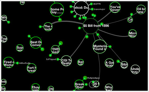
Digg is a website which allows its users to select (digg) things that they find interesting. Other users then read and rate these nuggets, and this determines how popular an item is; building a community of users who sieve online content and disgard the junk.
The Digg Swarm shows the process visually. Stories arrive as little circles, and the diggers “swarm” around them. As stories get more popular, they increase in size and as people dig more stories they also increase in size.
It’s a great representation of some complex data relationships; it’s also a really hypnotic display. Courtesy of Stamen Design who are doing lots of wonderful stuff – not just the pretty.
I love visual explanation’s of complex data. The classic of course is this 19th century chart drawn by Charles Joseph Minard. Beginning at the Polish-Russian border, it shows the size of Napolean’s army as the width of a line that shrinks from an initial size of 600,000 in June of 1812 to fewer than 10,000 by early December. As well as the number of troops remaining, the chart also shows geography, time, temperature and the course and direction of the army’s movement.
And here’s an article from the Economist (Dec ’07) which describes a couple of pioneering charts (one from that well-known statistician Florence Nightengale). But I particularly liked this:
And Playfair was already making a leap of abstraction that few of his contemporaries could follow. Using the horizontal and vertical axes to represent time and money was such a novelty that he had to explain it painstakingly in accompanying text. “This method has struck several persons as being fallacious”, he wrote, “because geometrical measurement has not any relation to money or to time; yet here it is made to represent both.”