Project Management as a treeswing
22 Nov 2012
Talking to a customer t’other day and I mentioned the (infamous) tree swing cartoon. He had no idea what I was talking about.
22 Nov 2012
Talking to a customer t’other day and I mentioned the (infamous) tree swing cartoon. He had no idea what I was talking about.
25 Oct 2010
There are a thousand sites out there which offer free (or almost free) wordpress themes; many of which look very very similar.
But earlier this year, I found www.themeforest.net which offered, not only the ubiquitous wordpress themes, but themes (or templates or skins or layouts, call-them-what-you-will) for admin pages and content management systems.
Why haven’t I come across this before? I spend so much time building back-end control panel and sometimes I really feel that I should add a sticker which says “No Designers were harmed in the making of this product” Will definitely be using some of these in the future.
Here’s an example showing Cleanity

20 Feb 2008
This is a Digg Swarm
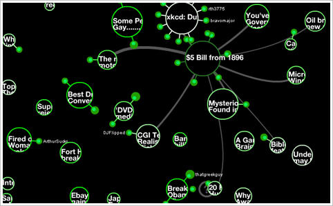
Digg is a website which allows its users to select (digg) things that they find interesting. Other users then read and rate these nuggets, and this determines how popular an item is; building a community of users who sieve online content and disgard the junk.
The Digg Swarm shows the process visually. Stories arrive as little circles, and the diggers “swarm” around them. As stories get more popular, they increase in size and as people dig more stories they also increase in size.
It’s a great representation of some complex data relationships; it’s also a really hypnotic display. Courtesy of Stamen Design who are doing lots of wonderful stuff – not just the pretty.
I love visual explanation’s of complex data. The classic of course is this 19th century chart drawn by Charles Joseph Minard. Beginning at the Polish-Russian border, it shows the size of Napolean’s army as the width of a line that shrinks from an initial size of 600,000 in June of 1812 to fewer than 10,000 by early December. As well as the number of troops remaining, the chart also shows geography, time, temperature and the course and direction of the army’s movement.
And here’s an article from the Economist (Dec ’07) which describes a couple of pioneering charts (one from that well-known statistician Florence Nightengale). But I particularly liked this:
And Playfair was already making a leap of abstraction that few of his contemporaries could follow. Using the horizontal and vertical axes to represent time and money was such a novelty that he had to explain it painstakingly in accompanying text. “This method has struck several persons as being fallacious”, he wrote, “because geometrical measurement has not any relation to money or to time; yet here it is made to represent both.”